Aesthetics of Communication: The Intricate Marriage of Fonts and Emotions
In the intricate realm of design, where every nuance matters, typography emerges as a silent yet commanding force, orchestrating the aesthetics of communication. More than a mere assemblage of letters, typography is a nuanced art form that shapes the emotional resonance of messages. It is the careful selection of fonts, the thoughtful arrangement of letters, and the visual dance of characters that breathe life into written words.
- Choosing Fonts: The Art of Emotional Elocution
Every font carries its own personality, a subtle undertone that speaks to the reader’s emotions. Serif fonts, with their classic and timeless elegance, often project a sense of tradition and reliability. Sans-serif fonts, on the other hand, exude modernity and a clean aesthetic, ideal for conveying a contemporary vibe. Script fonts, with their handwritten charm, may evoke feelings of warmth and intimacy.
The art lies in selecting fonts that align with the intended emotional resonance of the message. A financial institution aiming for trustworthiness might opt for a sturdy serif font, while a tech startup seeking innovation might lean towards a sleek sans-serif typeface. The aesthetics of communication, in this regard, become a dance between the visual elements and the emotional notes they strike.
- Arranging Letters: The Symphony of Layout
Typography extends beyond the mere selection of fonts; it’s the orchestration of letters into a harmonious composition. The arrangement of text influences the flow of information and guides the reader’s eye. Kerning, leading, and tracking become the conductor’s baton, dictating the rhythm of the visual narrative.
Consider a magazine layout where headlines demand attention with bold, eye-catching fonts, while body text, in a complementary typeface, ensures seamless readability. The aesthetics of communication are in the deliberate juxtaposition of font sizes, spacing, and alignment—a symphony that guides the reader through a visual journey.
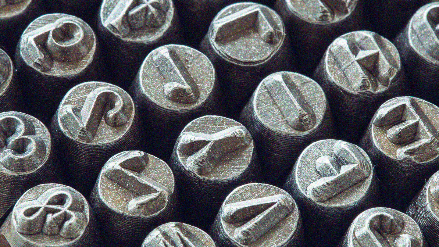
- Visual Dance of Characters: The Flourish and Flair
Typography allows for the introduction of character, quite literally. Beyond the standard characters of the alphabet, special characters, ligatures, and typographic embellishments add flair and personality to the written word. It’s the swash of a capital letter, the flourish of a ligature, or the strategic use of italics that injects life into typography.
In the aesthetics of communication, these stylistic choices can convey a sense of playfulness, sophistication, or urgency. They become the brushstrokes on the canvas of text, transforming a mundane message into a visually captivating experience. The dance of characters is a subtle art form that invites readers to engage with the content on a visual and emotional level.
In the grand tapestry of design, where words transcend their literal meanings, typography emerges as the brush that paints emotions and orchestrates the aesthetics of communication. It’s the artful synergy of fonts, layouts, and characters that transforms words into a visual symphony, leaving an indelible imprint on the reader’s mind and heart.
As we draw the curtain on our exploration of typography, it becomes evident that this seemingly modest element transcends its role as a mere conveyer of words. Instead, it is a masterful conductor orchestrating a symphony of emotions, a visual maestro breathing life into the written language.
In understanding the aesthetics of communication through typography, we find that the art lies not only in the selection of fonts but in the careful arrangement of letters and the subtle dance of characters. Each typographic choice carries a nuanced message, and every layout decision dictates the rhythm of the visual narrative.