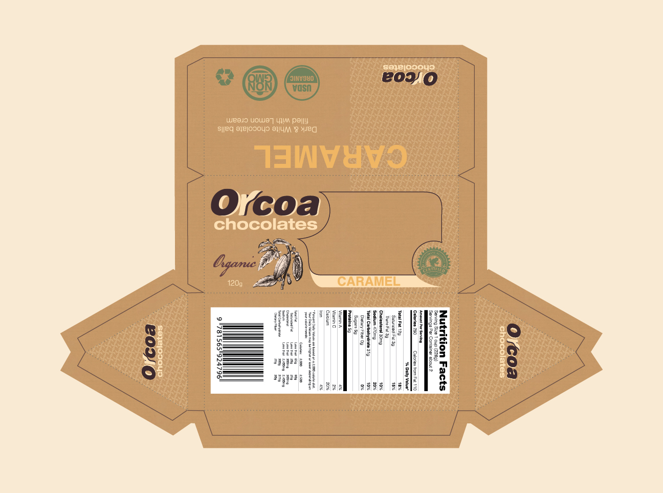
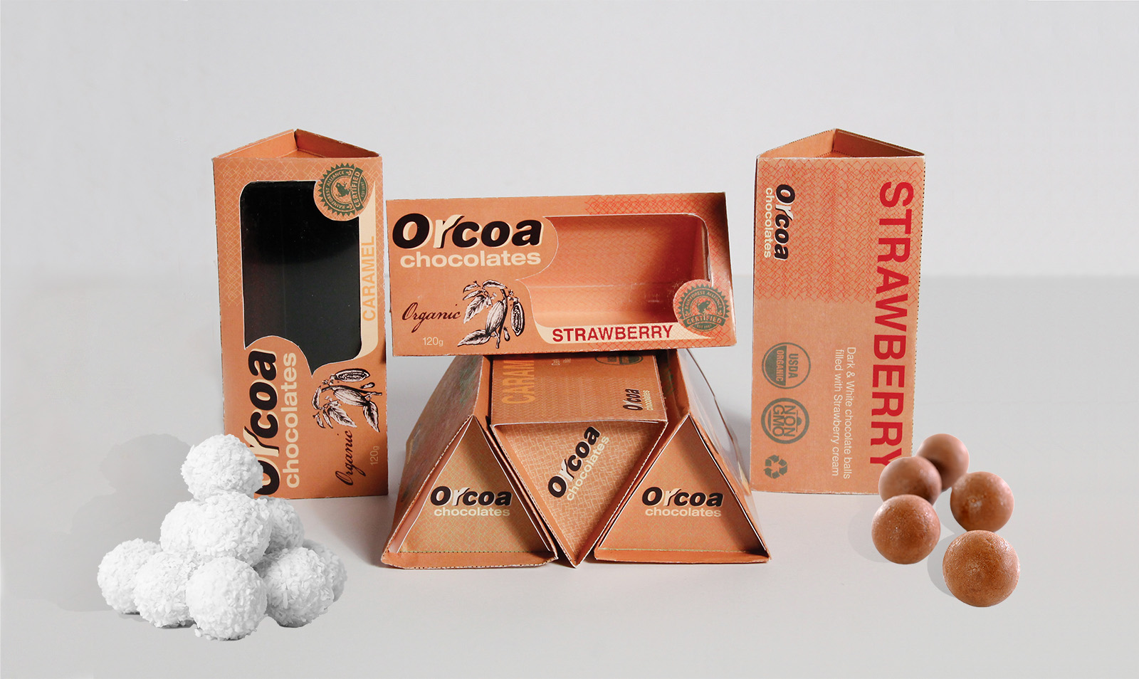
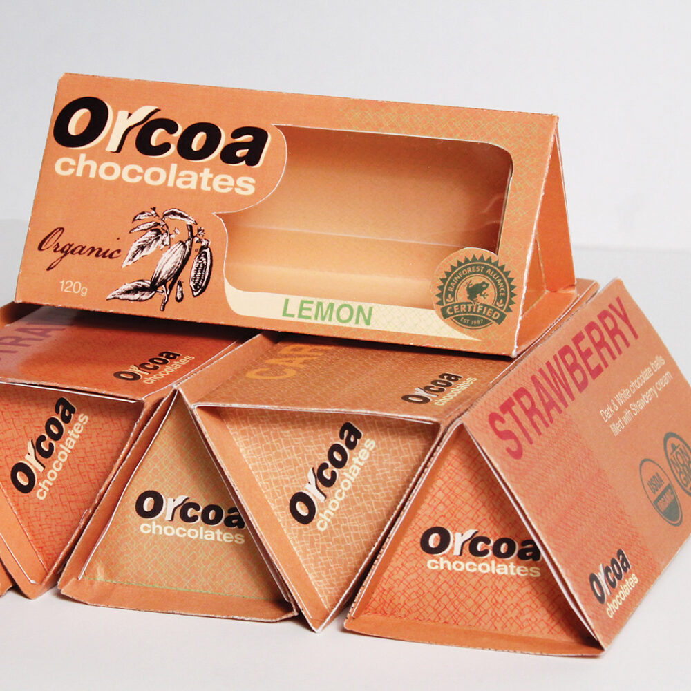
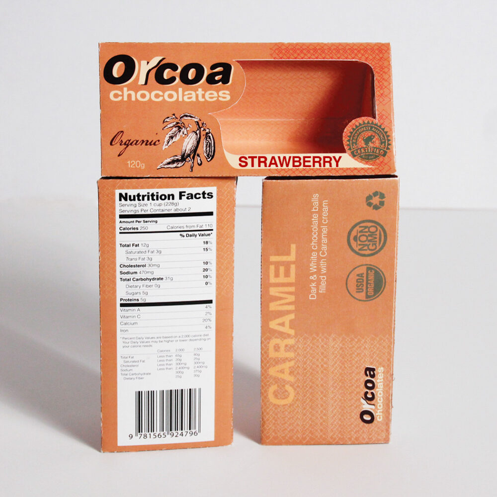
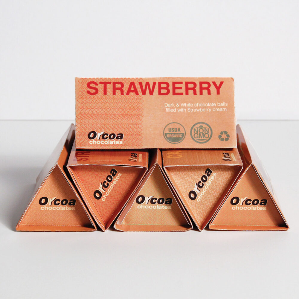
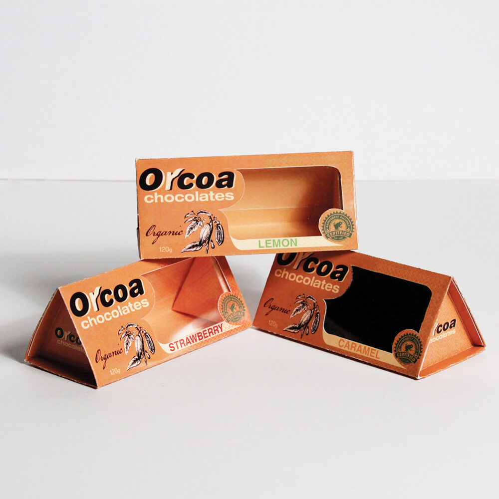
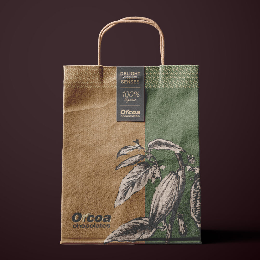
Orcoa has assorted dark and white chocolate balls filled with cream of different flavors. The brand naming was derived from the intersection of two words, organic and cocoa.
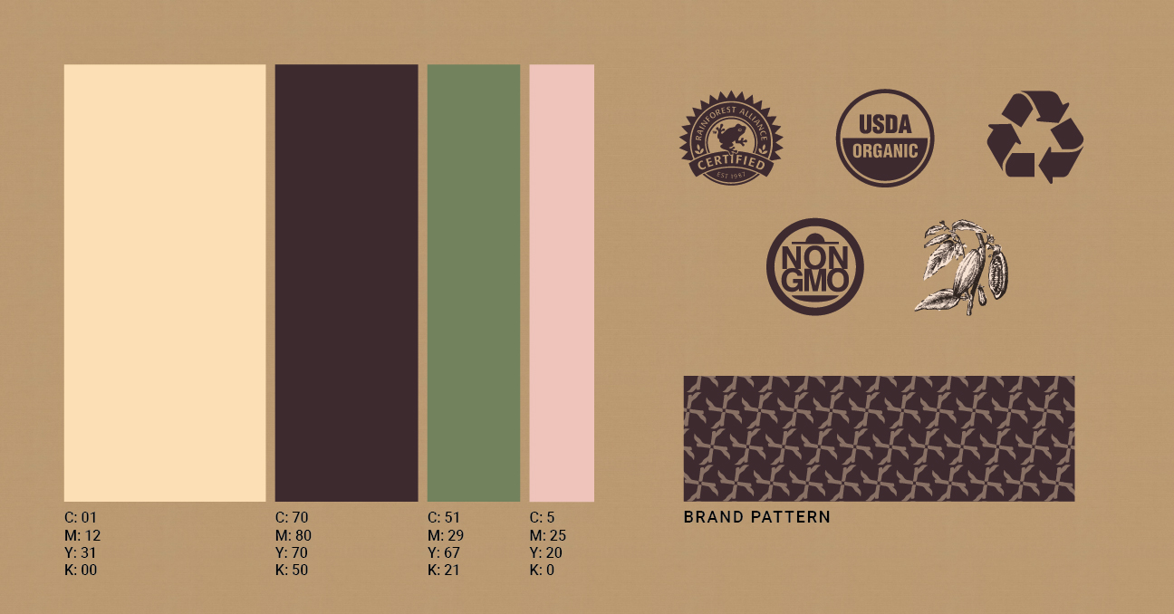
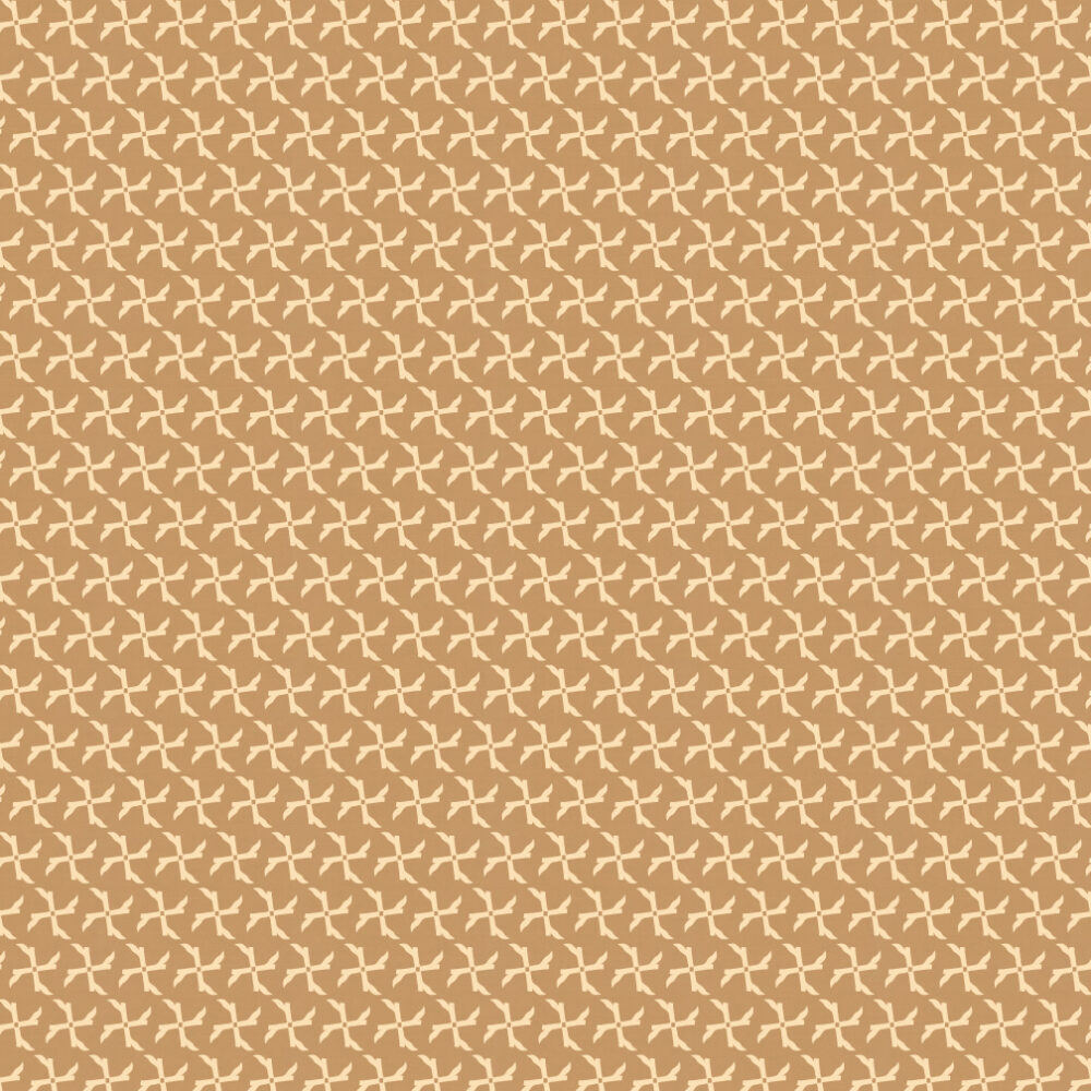
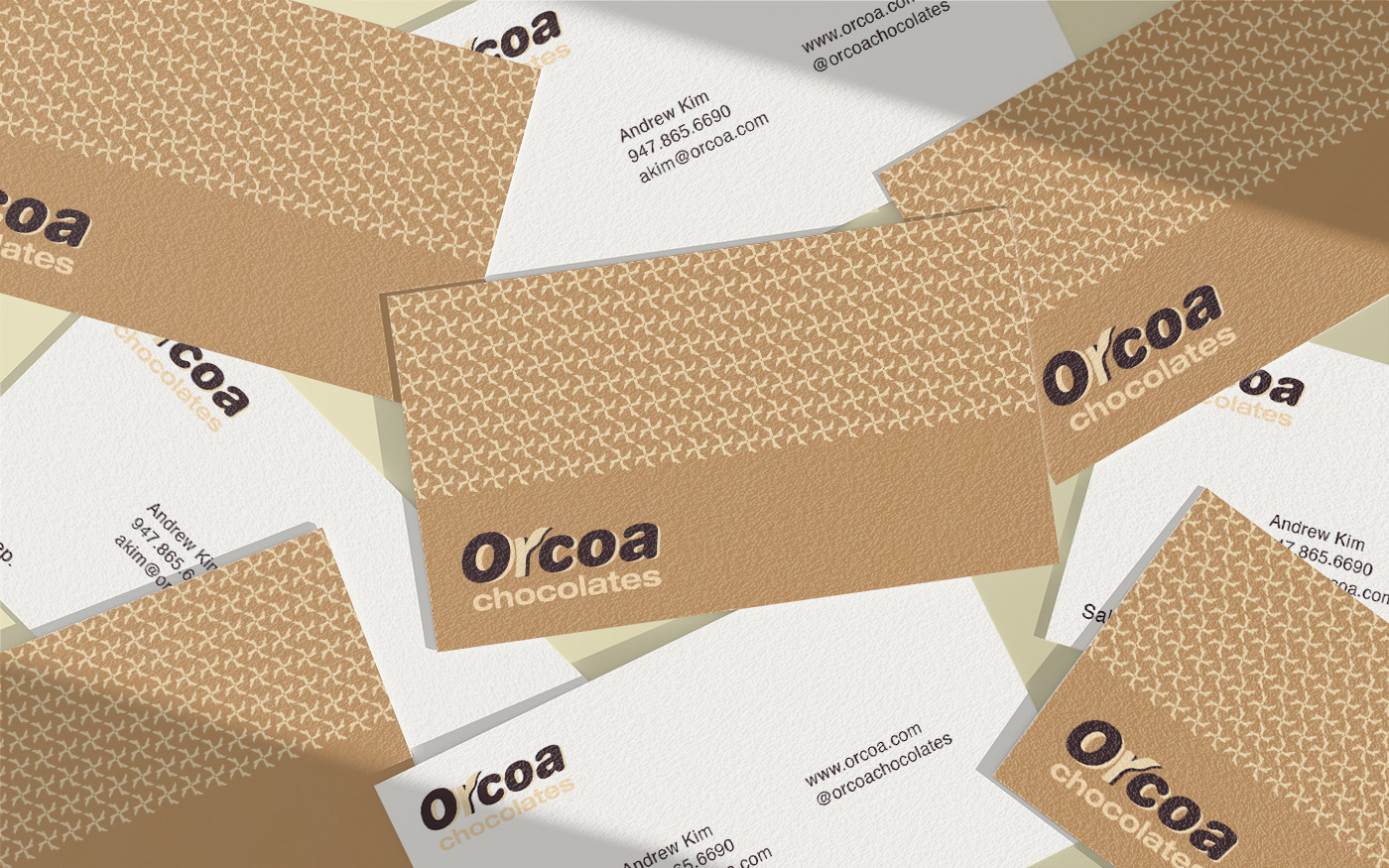
The visual identity is a testament to minimalistic style, with its geometric structure and fonts. The logo portrays roundness and fancy playfulness. It also highlights the organic brand messaging.
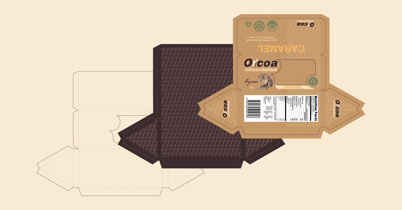
The triangular custom packaging structure gives balance and also differentiates the brand from its competitors when items are placed on the shelves of stores and supermarkets. Its structure makes storing, shipping, and handling from place to place easier, saving space and money on logistics.